OVARIAN CANCER ACTION
REVOLT
REBRAND
Giving ovarian cancer the focus it needs for every woman to be a survivor.
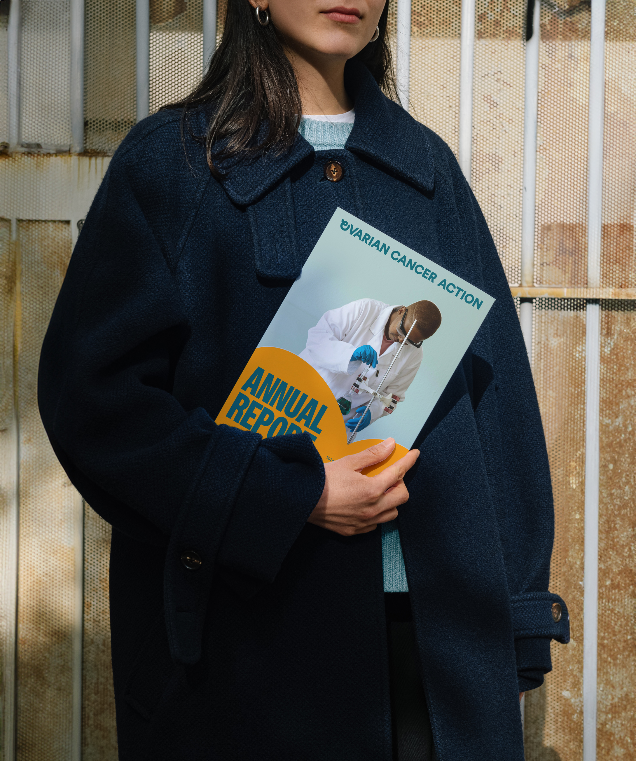
To accelerate progress in the fight against ovarian cancer, Ovarian Cancer Action, the UK’s leading ovarian cancer research charity, sought to redefine its brand. The goal was to create a powerful identity that would inspire greater action, reach a wider audience, and align with the charity’s mission of saving lives through increased awareness and research.
FEATURED IN
︎︎︎ It’s Nice That
︎︎︎ Creative Boom
︎︎︎ The Brand Identity
THE LOGO
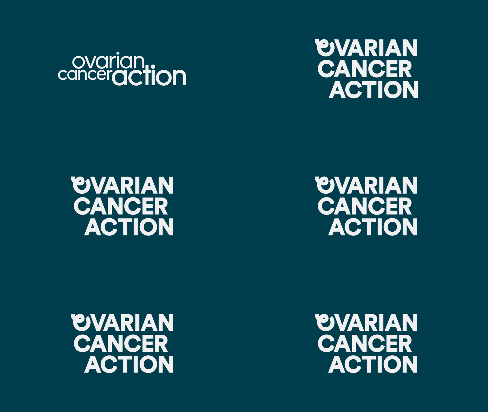
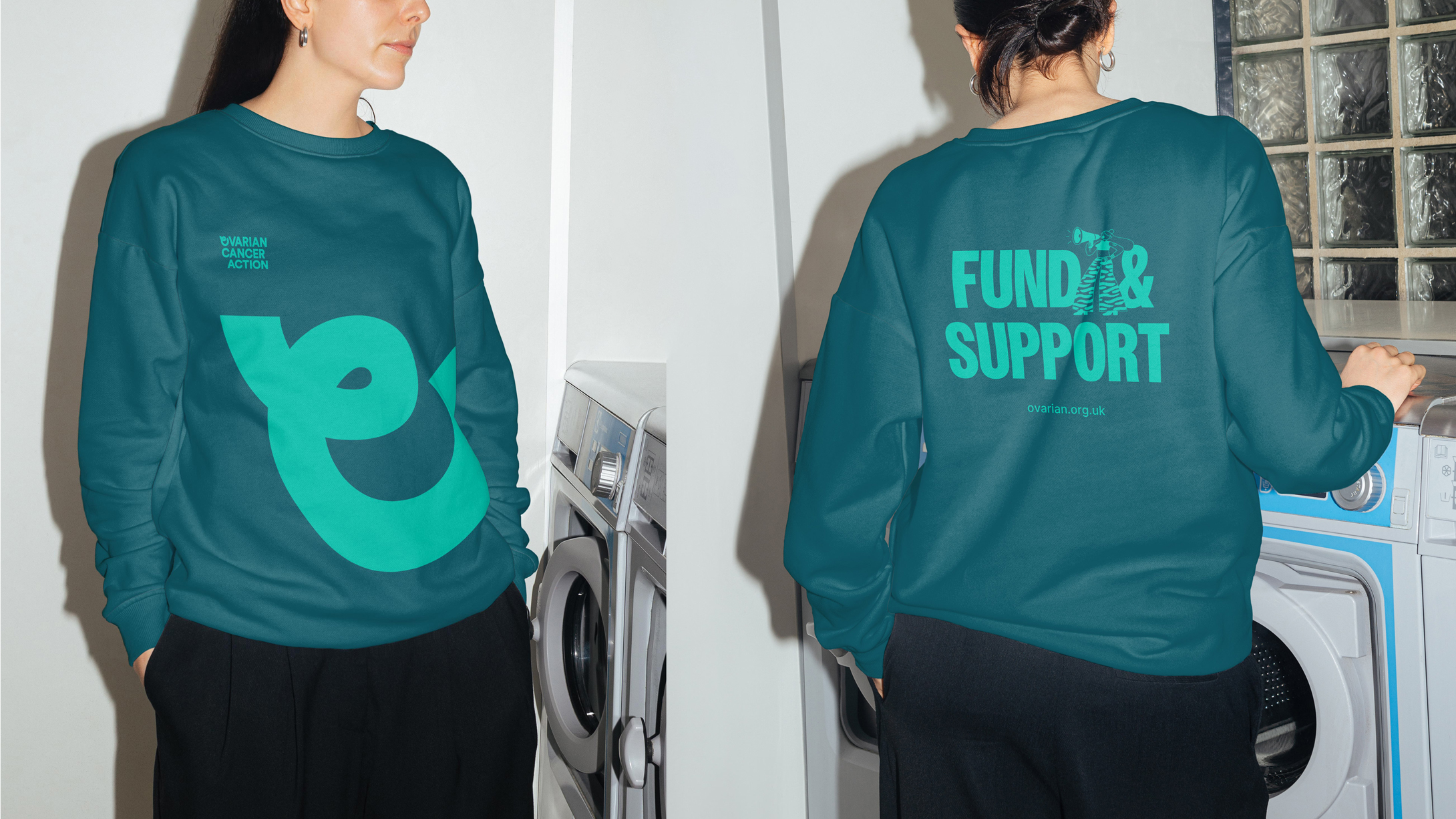
The identity centres on a custom ‘O’, a symbol that nods to both the ovarian form and the cancer awareness ribbon. It anchors the logotype and extends outward into the entire brand system, from iconography to motion. A visual cue for the shift from passive awareness to active advocacy.
The identity centres on a custom ‘O’, a symbol that nods to both the ovarian form and the cancer awareness ribbon. It anchors the logotype and extends outward into the entire brand system, from iconography to motion. A visual cue for the shift from passive awareness to active advocacy.

VERBAL & VISUAL IDENTITY
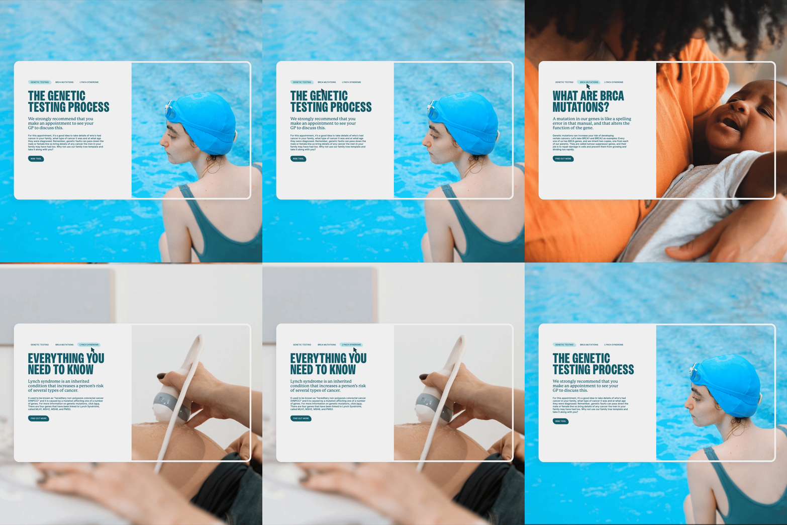
Connecting the visual identity with our brand strategy, the challenge was crafting a tone that allowed the brand to be loud for fundraising and advocacy, while also providing empathetic guidance when necessary.



ILLUSTRATIONS
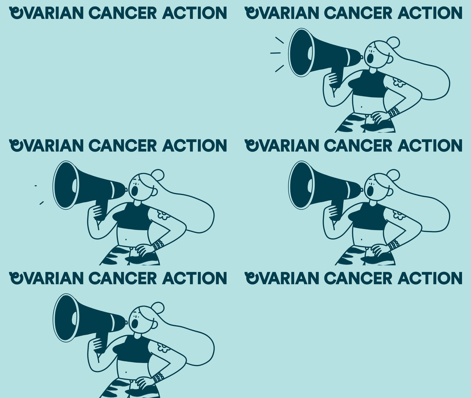
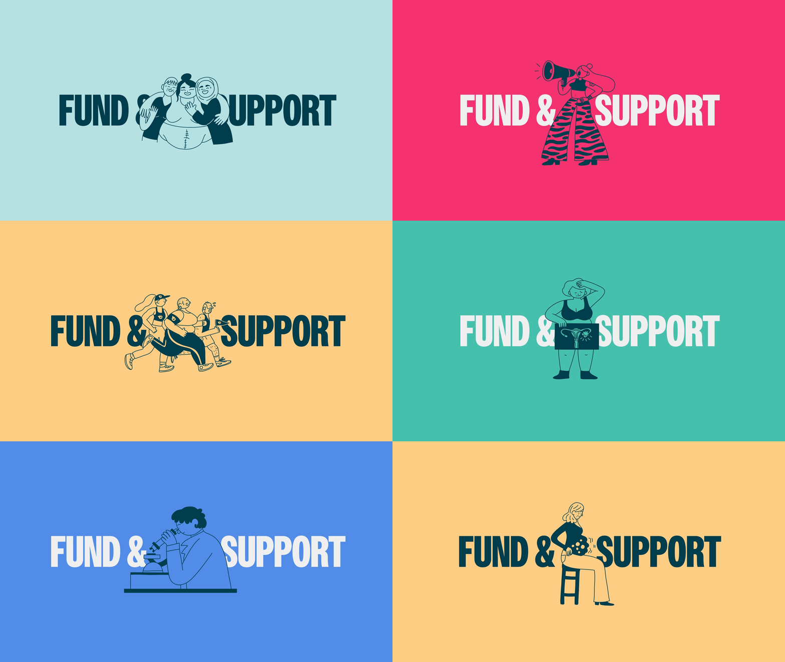
We collaborated with Cécile Dormeau to create an illustration library that perfectly captures complex emotions and narratives. Her bold, body-positive style adds warmth, relatability and representation to a subject often shrouded in fear.
We collaborated with Cécile Dormeau to create an illustration library that perfectly captures complex emotions and narratives. Her bold, body-positive style adds warmth, relatability and representation to a subject often shrouded in fear.



DESIGN
Shahina Ahmed
Myron Darlington
Inês Segadães
ILLUSTRATION
Cécile Dormeau
MOTION
